Website Design Best Practices: The Homepage Experience
Anyone with a driver’s license can get from point A to point B in a car. But to excel as a professional in NASCAR or Formula One racing, you’ve got to have some serious skills that are attained through years of study and real-world experience.
Website design works the same way.
Although you, or someone you know, may be able to put together a website, calling upon the expertise of a professional can go a long way in helping you reach the “finish line” ahead of your competitors.
There’s both an art and a craft to website design — not only in creating an attractive aesthetic, but also in determining the precise functionality and purpose of each web page. A well-designed website ensures everything works smoothly, communicates a clear message, and provides easy-to-identify next steps for visitors.
This is often referred to as the User Experience (UX) — the culmination of form, function, and message.
In this installment of Website Design Best Practices, let’s focus on a few key elements of a successful homepage.
Website Navigation
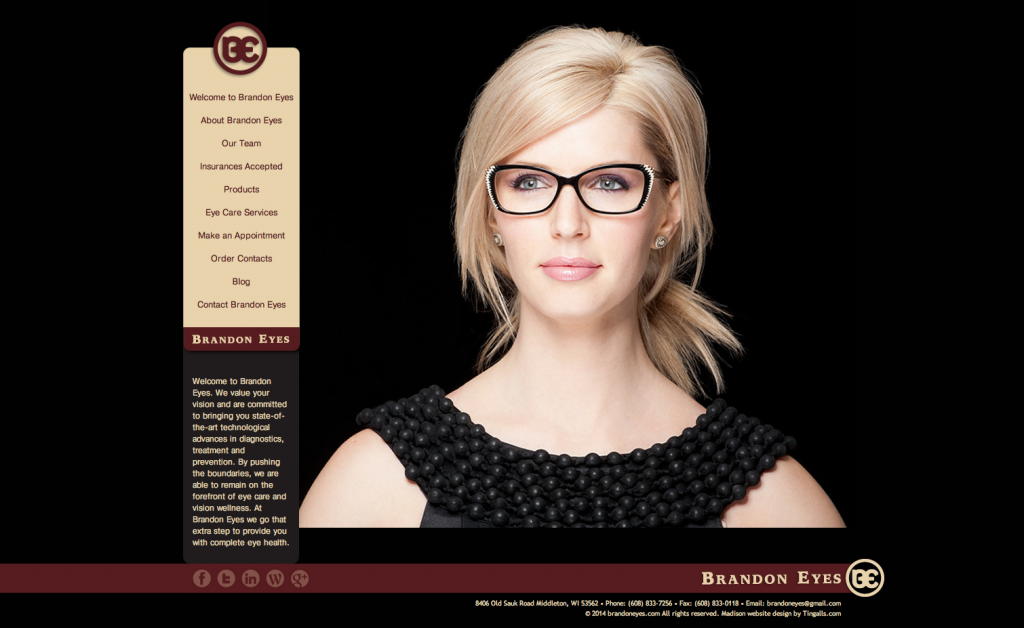
Whether you choose a vertical navigation — like the one we created for Brandon Eyes — or a horizontal navigation, it should always be simple and customer-centric. Avoid being metaphorical or using industry jargon that only you understand.
If you have a dropdown or fly-out menu, each subpage should be listed in an order that makes sense for the visitor — not necessarily what is most important to you.
Alphabetical order is often a good option, especially if your dropdown menu is a long “laundry list” of services.
The key point to remember: your visitor shouldn’t have to work hard to find what they’re looking for.
Imagery & Photography

generic stock image
Your website imagery should be engaging and connect with the viewer on some level. Often an emotional connection is the goal, but imagery can also help establish the tone of your brand. Are you trying to communicate something warm, friendly, approachable, professional, or bold?
At Tingalls Graphic Design, we work with our clients to make sure the imagery used on their websites aligns with both their brand identity and business goals.
While stock photography can be a quick way to populate a website, unique photography is almost always the stronger choice.
Regardless of the source, it’s best to avoid overly generic images like the one here >
Website Button Design
Buttons — sometimes referred to as widgets back in the day — are your friend.
Used wisely, they can guide a customer and tell them exactly where to go next. Like a good traffic cop, well-designed buttons clearly and quickly direct visitors through your website.
Want to highlight a new product or service? Or drive customers to a particular page?
Buttons make it easy.
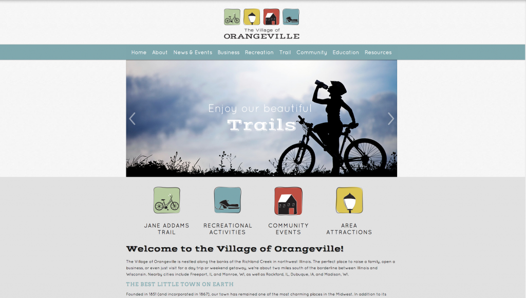
The simpler you make it for someone to go where you want them to go, the more likely they are to get there. Here’s an excellent example of button use that Tingalls Graphic Design created for The Village of Orangeville.
Clear Copy
The copy on your website — including your headlines — also needs to be clear, specific, and benefit-driven, while still being engaging and customer-friendly.
Nobody cares if you’ve won 20 awards. Customers care whether you can solve a problem or address a pain point they have.
Make sure your website clearly explains how you can help them.
Thank you for visiting Tingalls Graphic Design! If you need any type of assistance with your website, please contact us to set up a complimentary website design meeting to discuss your needs further.